
Why it stands out:
- 1. Dark UI with high contrast
- 2. Data visualization for transparency
- 3. Minimalist yet informative UI
- 4. Strategic branding
- 5. Mobile-friendly and responsive
VISIT SITE ->
001
UNITED24 Rebuild Map

Why it stands out:
- 1. Bold, engaging typography
- 2. Friendly and playful aesthetic
- 3. Clever use of whitespace
- 4. Effective call-to-action buttons
- 5. Illustrative storytelling
VISIT SITE ->
002
HeyFriends!

Why it stands out:
- 1. Typographic storytelling
- 2. Engaging interactive elements
- 3. Striking color contrast
- 4. Minimalist yet bold layout
- 5. Cultural immersion through design
VISIT SITE ->
003
Abetka UA

Why it stands out:
- 1. Branded, product-first aesthetic
- 2. Creative typography choices
- 3. Engaging visual textures
- 4. Playful illustrations
- 5. Well-structured information hierarchy
VISIT SITE ->
004
B-Egg Farm

Why it stands out:
- 1. Elegant, editorial typography
- 2. Dark mode hero section
- 3. Handwritten annotation effects
- 4. Illustrative storytelling
- 5. Intentional whitespace and hierarchy
VISIT SITE ->
005
Ellipsus

Why it stands out:
- 1. Cinematic typography-driven hero section
- 2. Strong brand integration
- 3. Dark mode aesthetic with neon contrast
- 4. Seamless blend of typography and visuals
- 5. Subtle yet effective interactivity
VISIT SITE ->
006
Mona Sans & Hubot Sans (GitHub)

Why it stands out:
- 1. Minimalist, product-first design
- 2. Gradient-rich typography for branding
- 3. Seamless product ecosystem display
- 4. Dynamic layout and fluid animations
- 5. Cohesive brand identity
VISIT SITE ->
007
Apple Siri

Why it stands out:
- 1. Retro-futuristic hacker aesthetic
- 2. Interactive component showcase
- 3. Bold, high-contrast typography
- 4. Dynamic, modular grid layout
- 5. Nostalgic VHS-style animations
VISIT SITE ->
008
Overrrides

Why it stands out:
- 1. Retro-modern typography
- 2. Vibrant color palette
- 3. Modular layout with organic shapes
- 4. Balanced use of visuals and data
- 5. Well-structured call-to-actions (CTAs)
VISIT SITE ->
009
Mode

Why it stands out:
- 1. High-end, immersive 3D visuals
- 2. Minimalist UI with futuristic elegance
- 3. Seamless scrolling experience
- 4. Typography that complements the visuals
- 5. Strong emphasis on visual storytelling
VISIT SITE ->
010
Lusion

Why it stands out:
- 1. Experimental typography as storytelling
- 2. Split-screen layout for immersive browsing
- 3. Vintage-inspired visual storytelling
- 4. Fluid interactions and parallax effects
- 5. Elegant use of negative space
VISIT SITE ->
011
The Message to Ukraine (Obys Agency)

Why it stands out:
- 1. Maximalist and chaotic in the best way
- 2. Oversized typography with personality
- 3. Interactive and unconventional navigation
- 4. Mixed media aesthetic
- 5. Defies corporate norms
VISIT SITE ->
012
DIKO

Why it stands out:
- 1. A sophisticated, data-driven aesthetic
- 2. Typography that blends authority with refinement
- 3. Interactive dashboard-style visuals
- 4. Minimalist navigation with strong CTAs
- 5. A structured layout that feels premium
VISIT SITE ->
013
Ventriloc
Why it stands out:
- 1. Fully embraces Barbiecore aesthetics
- 2. Immersive, interactive 3D elements
- 3. Typography that breaks conventions
- 4. Blending nostalgia with digital innovation
- 5. Dynamic scrolling experience
VISIT SITE ->
014
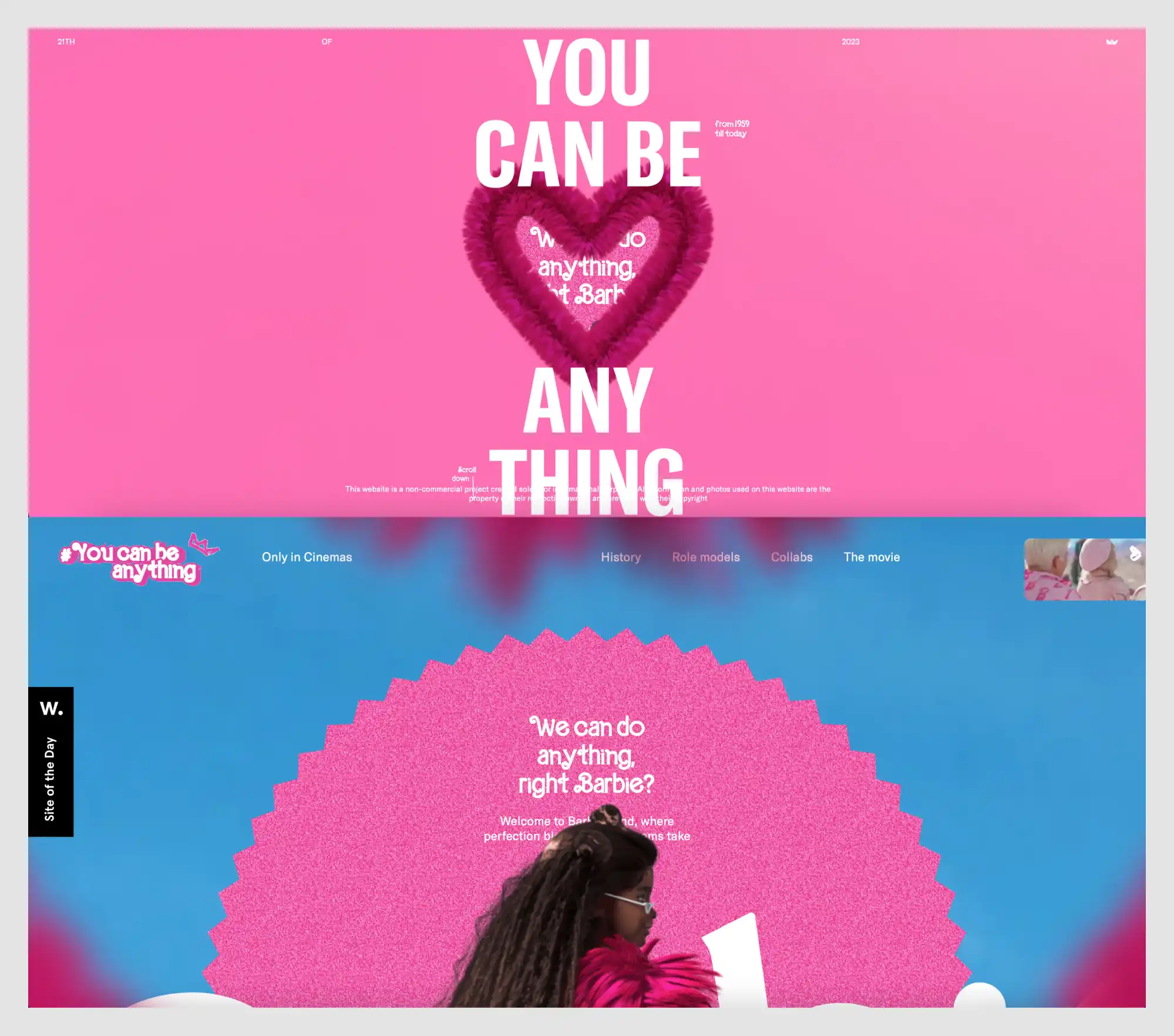
You Can Be Anything (TFTL Agency)

Why it stands out:
- 1. Educational and experimental approach to design
- 2. Highly structured yet chaotic layout
- 3. Minimalist yet striking color scheme
- 4. Interactive learning experience
- 5. Typography as a design element
VISIT SITE ->
016
GRIDS (Obys Agency)

Why it stands out:
- 1. Modular, grid-based layout
- 2. Minimalist yet high-impact typography
- 3. Clean, brutalist-inspired aesthetics
- 4. Playful use of error states and interactive elements
- 5. Balanced contrast of corporate and experimental
VISIT SITE ->
017
Depo Studio
Why it stands out:
- 1. High-impact color scheme
- 2. Massive, statement-making typography
- 3. Minimal but strong visual hierarchy
- 4. Subtle yet effective interactive elements
- 5. A visual identity that aligns with the brand’s ethos
VISIT SITE ->
018
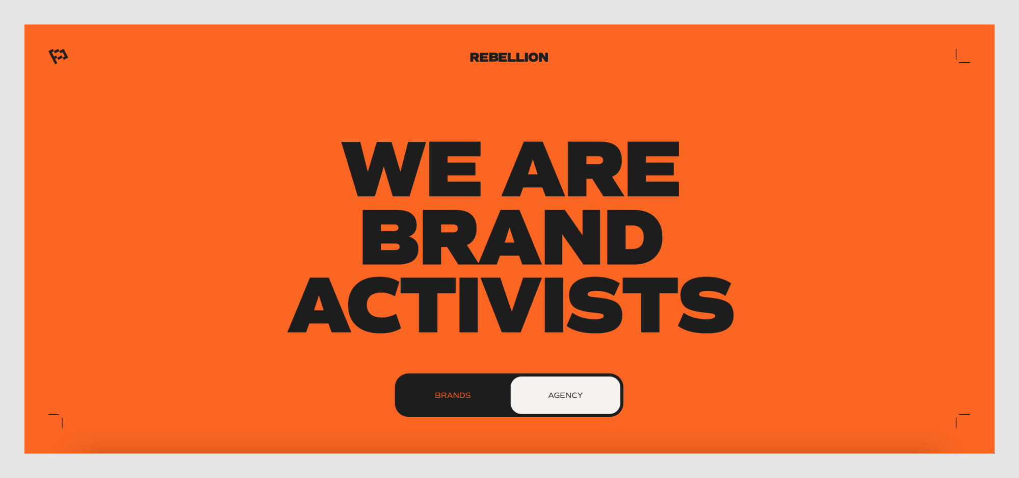
Rebellion
Why it stands out:
- 1. Striking generative design elements
- 2. Strong typographic hierarchy
- 3. Minimal but sophisticated navigation
- 4. Subtle use of gradients and motion
- 5. A perfect fusion of tech and art
VISIT SITE ->
019
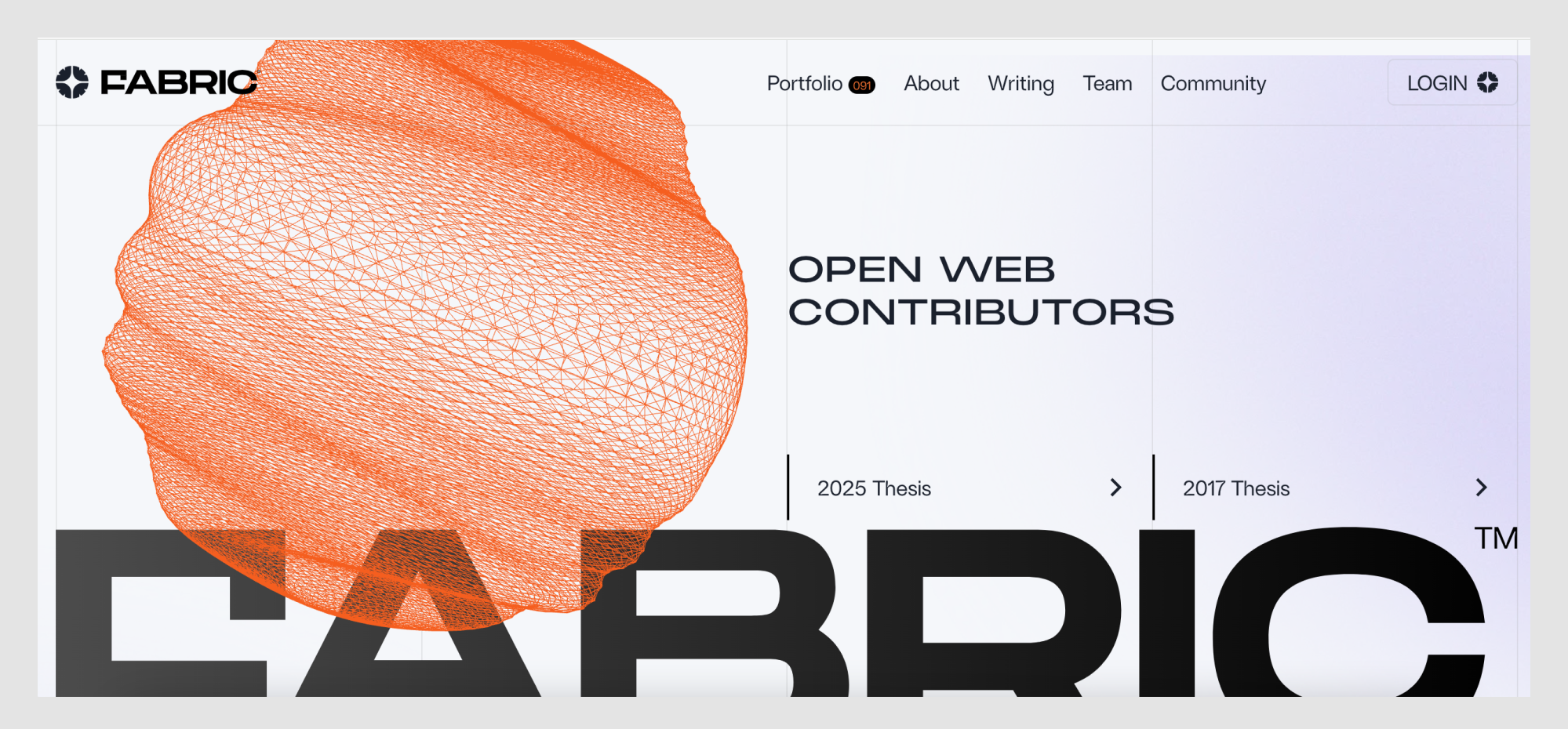
Fabric

Why it stands out:
- 1. Playful yet technical branding
- 2. Bold, high-contrast color scheme
- 3. Minimalist yet quirky typography
- 4. Memes and gamification as engagement tools
- 5. Clever use of microcopy and interaction cues
VISIT SITE ->
020
Hydra

Why it stands out:
- 1. Vibrant, collage-inspired visuals
- 2. Layered storytelling approach
- 3. Bold typography with personality
- 4. Structured information hierarchy
- 5. Engaging and interactive elements
VISIT SITE ->
021
StoryMakers Project

Why it stands out:
- 1. Dark, futuristic aesthetic
- 2. Typography with dynamic contrast
- 3. Subtle but effective motion design
- 4. Strategic call-to-action placement
- 5. Strong industry positioning
VISIT SITE ->
022
Auxility

Why it stands out:
- 1. Minimalist, high-contrast aesthetic
- 2. Magazine-like layout
- 3. Collage-style visuals
- 4. Elegant typography with personality
- 5. Community-driven interaction
VISIT SITE ->
023
SEBTO

Why it stands out:
- 1. Cinematic first impression
- 2. Minimalist yet bold typography
- 3. Fluid and engaging scrolling experience
- 4. Nature-meets-technology aesthetic
- 5. Intuitive call-to-action placement
VISIT SITE ->
024
Pebble Life

Why it stands out:
- 1. Gamified approach to design education
- 2. Retro gaming aesthetic
- 3. Simple yet effective UI
- 4. Fun yet educational concept
- 5. Microinteractions for enhanced engagement
VISIT SITE ->
025
Can't Unsee

Why it stands out:
- 1. Editorial-style typography
- 2. Cinematic product presentation
- 3. Minimalist yet impactful layout
- 4. Playful text integration
- 5. Soft, natural color palette
VISIT SITE ->
026
MORAL

Why it stands out:
- 1. Bold and authoritative color presentation
- 2. Minimalistic yet informative layout
- 3. Engaging interactivity
- 4. A patriotic and culturally significant theme
VISIT SITE ->
027
прапор.укр (prapor.ukr)

Why it stands out:
- 1. Elegant dark mode interface
- 2. Conversational UI approach
- 3. Strong call-to-action with a clear value proposition
- 4. Smooth integration of AI-driven content
VISIT SITE ->
028
Fluent

Why it stands out:
- 1. Futuristic dark mode UI
- 2. Typography-driven impact
- 3. Blurred-glass effect for contrast
- 4. Well-integrated product showcase
VISIT SITE ->
029
Umbrel

Why it stands out:
- 1. Playful visual identity
- 2. Experimental typography
- 3. Layered, collage-like compositions
- 4. Vibrant, unexpected color choices
- 5. Minimalist layout with interactive storytelling
VISIT SITE ->
030
Dumy

Why it stands out:
- 1. Subtle, dynamic background texture
- 2. High-contrast typography
- 3. Minimalist but engaging UI
- 4. Interactive data visualization
- 5. Monochrome meets selective color
VISIT SITE ->
031
Enpower Trading

Why it stands out:
- 1. Bold, oversized typography
- 2. Unconventional color palette
- 3. Layered, interactive elements
- 4. Experimental branding
- 5. Cinematic photography integration
VISIT SITE ->
032
Flayks

Why it stands out:
- 1. Immersive card-based storytelling
- 2. Bold, primary color palette
- 3. Smooth and engaging animations
- 4. Layered depth and motion effects
- 5. Encourages exploration with intuitive navigation
VISIT SITE ->
034
The Web Can Do What!?

Why it stands out:
- 1. Hand-drawn, expressive illustrations
- 2. Playful animation and interactivity
- 3. Vibrant and unconventional color palette
- 4. Creative typography and hierarchy
- 5. Seamless navigation through storytelling
VISIT SITE ->
034
Crew by Tubik Studio

Why it stands out:
- 1. Bold typography for impact
- 2. Minimalist UI with strong hierarchy
- 3. Seamless Chrome integration
- 4. Grid-based visual storytelling
- 5. Strategic use of color and branding
VISIT SITE ->
036
SaveDay

Why it stands out:
- 1. Dynamic typography and layout
- 2. Collage-style visual composition
- 3. Technical and editorial contrast
- 4. Interactive navigation and micro-animations
- 5. Branded color and bold CTA integration
VISIT SITE ->
037
Adidas Arena

Why it stands out:
- 1. Futuristic and high-contrast aesthetic
- 2. Dynamic track-based UI
- 3. Interactive elements and live engagement
- 4. Minimal yet bold typography
- 5. Seamless onboarding and engagement CTAs
VISIT SITE ->
038
Metadrop

Why it stands out:
- 1. Minimalist, high-tech aesthetic
- 2. Highly structured yet playful layout
- 3. Striking product presentation
- 4. Multilingual and globally accessible
- 5. Iconography-driven navigation
VISIT SITE ->
039
Teenage Engineering

Why it stands out:
- 1. Bold, futuristic typography
- 2. Dynamic, modular layout
- 3. Monochromatic blue aesthetic
- 4. Interactive elements with depth
- 5. Minimalist but high-impact UI
VISIT SITE ->
040
Art+Tech Report

Why it stands out:
- 1. Sleek dark mode aesthetic
- 2. Realistic 3D interface presentation
- 3. Minimalist, high-impact typography
- 4. Subtle lighting effects
- 5. Interactive feel without overwhelming animations
VISIT SITE ->
041
Endless Tools

Why it stands out:
- 1. High-contrast, bold typography
- 2. Dynamic 3D product visualization
- 3. Minimalist dark mode aesthetic
- 4. Subtle motion effects
- 5. Clear product storytelling
VISIT SITE ->
042
Ethnocare

Why it stands out:
- 1. Modern dark UI with gradient highlights
- 2. Bold, engaging typography
- 3. Clear, developer-focused messaging
- 4. Strong call-to-action buttons
- 5. Open-source credibility
VISIT SITE ->
043
Appwrite

Why it stands out:
- 1. Minimalist and structured layout
- 2. Neutral color palette with soft contrasts
- 3. Typography hierarchy for clarity
- 4. Engaging imagery showcasing real interiors
- 5. Intuitive navigation with clear call-to-actions
VISIT SITE ->
044
Artbruno

Why it stands out:
- 1. Bold typography for a strong brand identity
- 2. Playful branding with illustrated characters
- 3. Dynamic, interactive elements
- 4. Vibrant color scheme
- 5. Seamless user experience
VISIT SITE ->
045
Flying Papers

Why it stands out:
- 1. Futuristic, tech-inspired aesthetic
- 2. Highly interactive elements
- 3. Custom animation-driven experience
- 4. Typography contrast for readability
- 5. Gamified navigation
VISIT SITE ->
045
Arrow Dynamics

Why it stands out:
- 1. Industrial, tech-forward aesthetic
- 2. High-contrast typography for impact
- 3. Grid-based layout with a structured feel
- 4. Minimal yet powerful call-to-action
- 5. Tech-style UI elements for a futuristic feel
VISIT SITE ->
046
Pinnacle Design Lab

Why it stands out:
- 1. Bold and striking typography
- 2. Minimalist yet impactful color scheme
- 3. Dynamic and unconventional text layout
- 4. Strong brand identity
- 5. Modern and bold aesthetic
VISIT SITE ->
047
Kovalska

Why it stands out:
- 1. High-impact black-and-white contrast
- 2. Minimal yet playful design elements
- 3. Strong focus on case studies
- 4. Refined typography and hierarchy
- 5. Smooth scrolling interactions
VISIT SITE ->
048
Tiny Wins

Why it stands out:
- 1. Editorial-style typography
- 2. Unique organic image frames
- 3. Grid-based yet asymmetrical layout
- 4. Subtle vintage aesthetic
- 5. Product-forward storytelling
VISIT SITE ->
049
Gemnote

Why it stands out:
- 1. Immersive 3D book showcase
- 2. Dark, cinematic aesthetic
- 3. Elegant editorial typography
- 4. Vertical navigation with progress indicators
- 5. Color-coded book sections
VISIT SITE ->
050
Stripe Press